
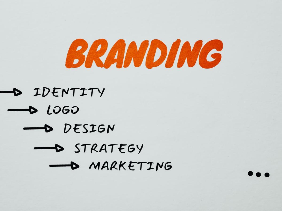
A logo is not a brand identity, and treating it as one is the single most common gap we see when auditing a founder's existing materials. A real system covers how the brand behaves across a dozen contexts it wasn't originally designed for.
Our internal checklist runs through logo lockups and clear space, a real color system (not just a hex code list), type pairing for both display and body use, photography and illustration direction, voice and tone guidelines, and — the six most-skipped items — icon style, data visualization style, motion principles, social templates, email templates, and a one-page "do/don't" misuse sheet.
Skipping those six is why so many brands look sharp on a homepage and fall apart the moment marketing needs a chart, a social carousel, or an animated intro. Building them up front costs a few extra days; retrofitting them later costs a rebrand.
The 12 points
1. Primary logo and lockups. 2. Clear space and minimum sizes. 3. A color system with roles, not just hex codes. 4. Type pairing for headlines and body text. 5. Photography and illustration direction. 6. Voice and tone guidelines. 7. Icon style. 8. Charts and data style. 9. Motion principles. 10. Social media templates. 11. Email templates. 12. A one-page do and don't sheet.
Consistency is also a search signal
The same name, logo, description and contact details across your website, social profiles and directories help people recognize you, and help search engines and AI assistants understand exactly who you are. A consistent brand is easier to trust and easier to recommend.